CHALLENGE
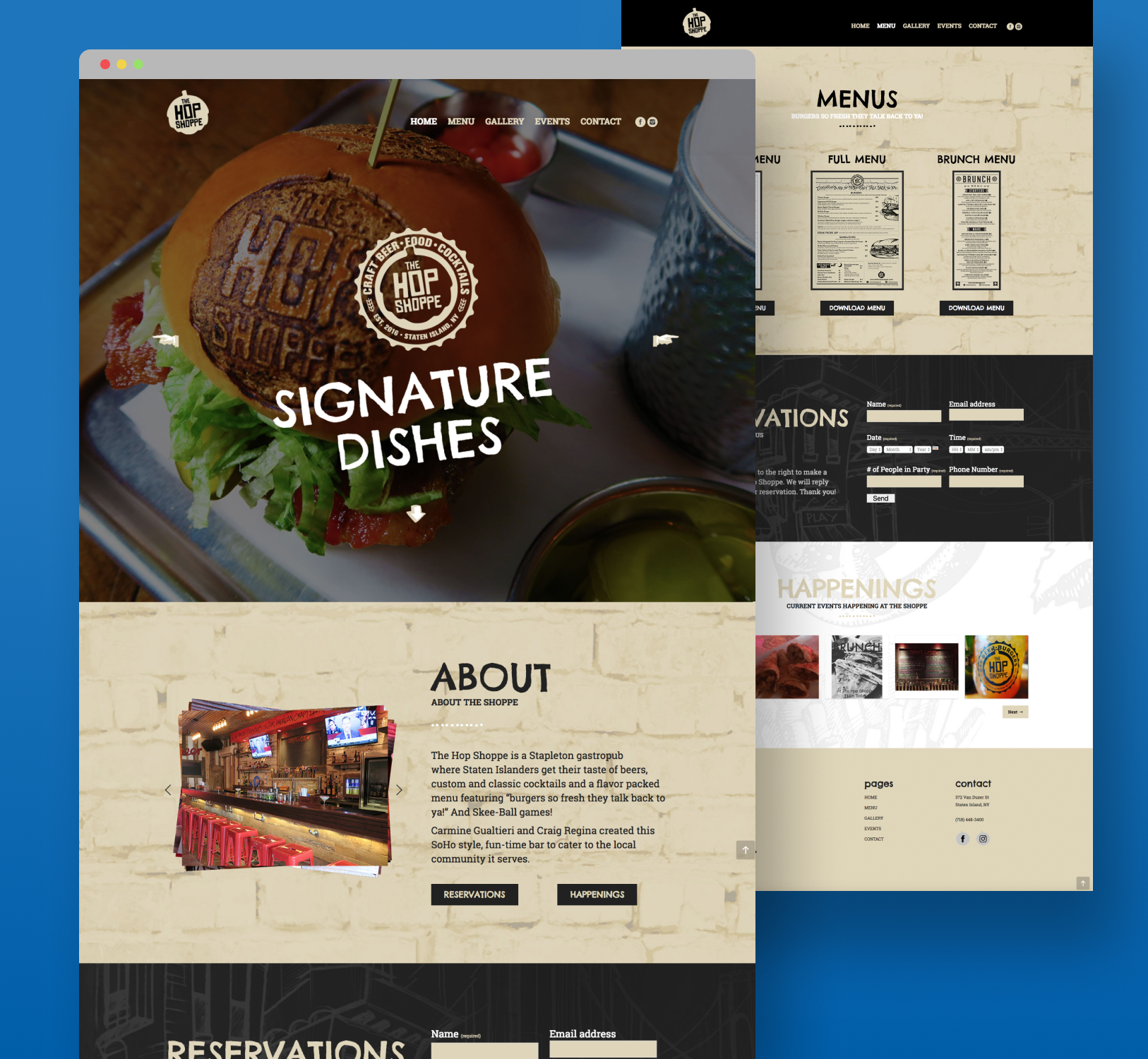
A new modern gastro pub was preparing to launch and needed a complete brand identity and website that captured its energetic, community-driven atmosphere. The goal was to attract a young, social crowd while maintaining authenticity and a strong connection to the local bar community. The project required a distinctive visual identity built around a reimagined “hop” icon, paired with a playful, approachable design language that would stand out across both digital and print materials. Additionally, the website needed to be ready for the grand opening, showcasing menu items, promoting events, and integrating seamlessly with social media.
SOLUTION
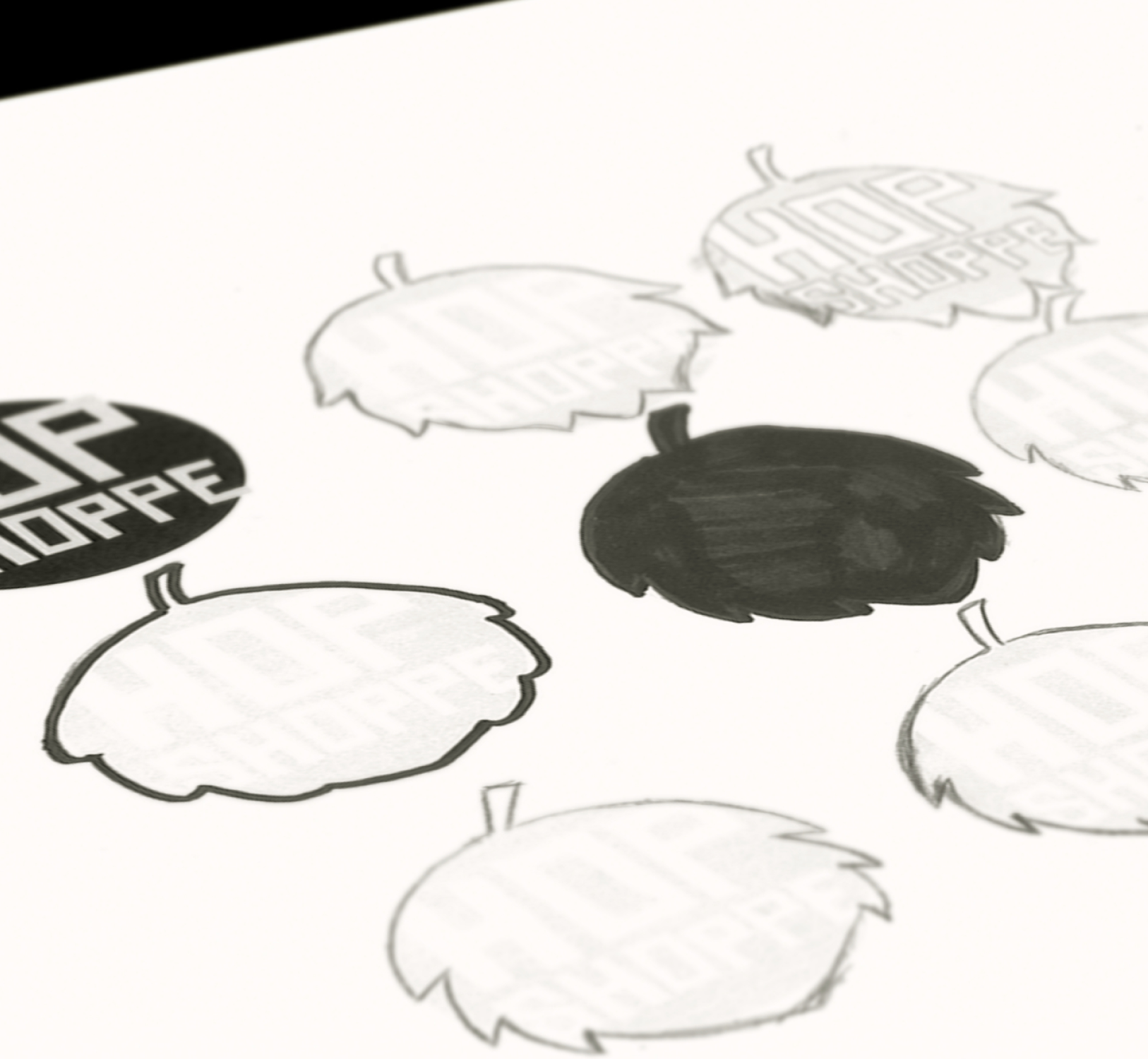
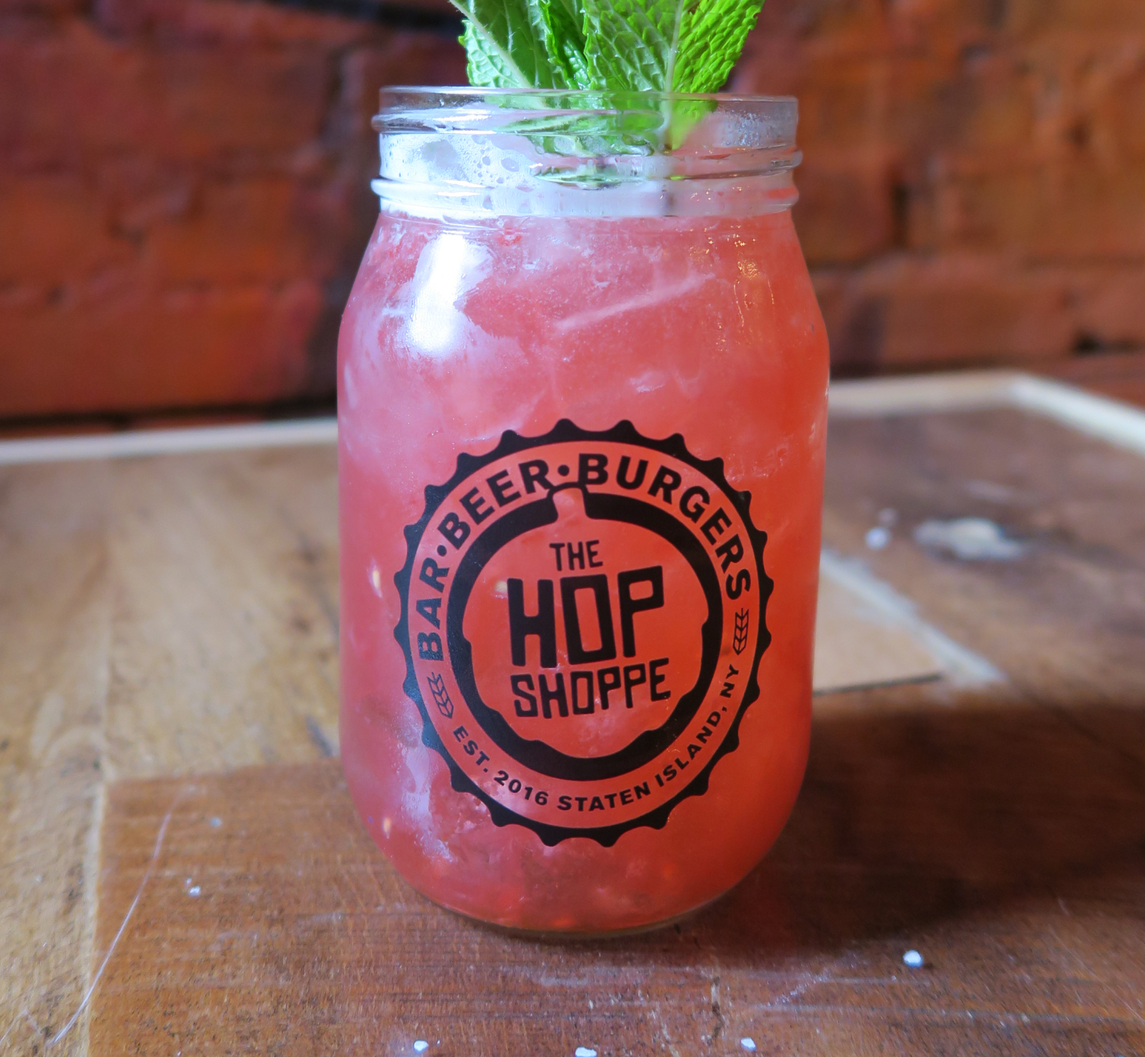
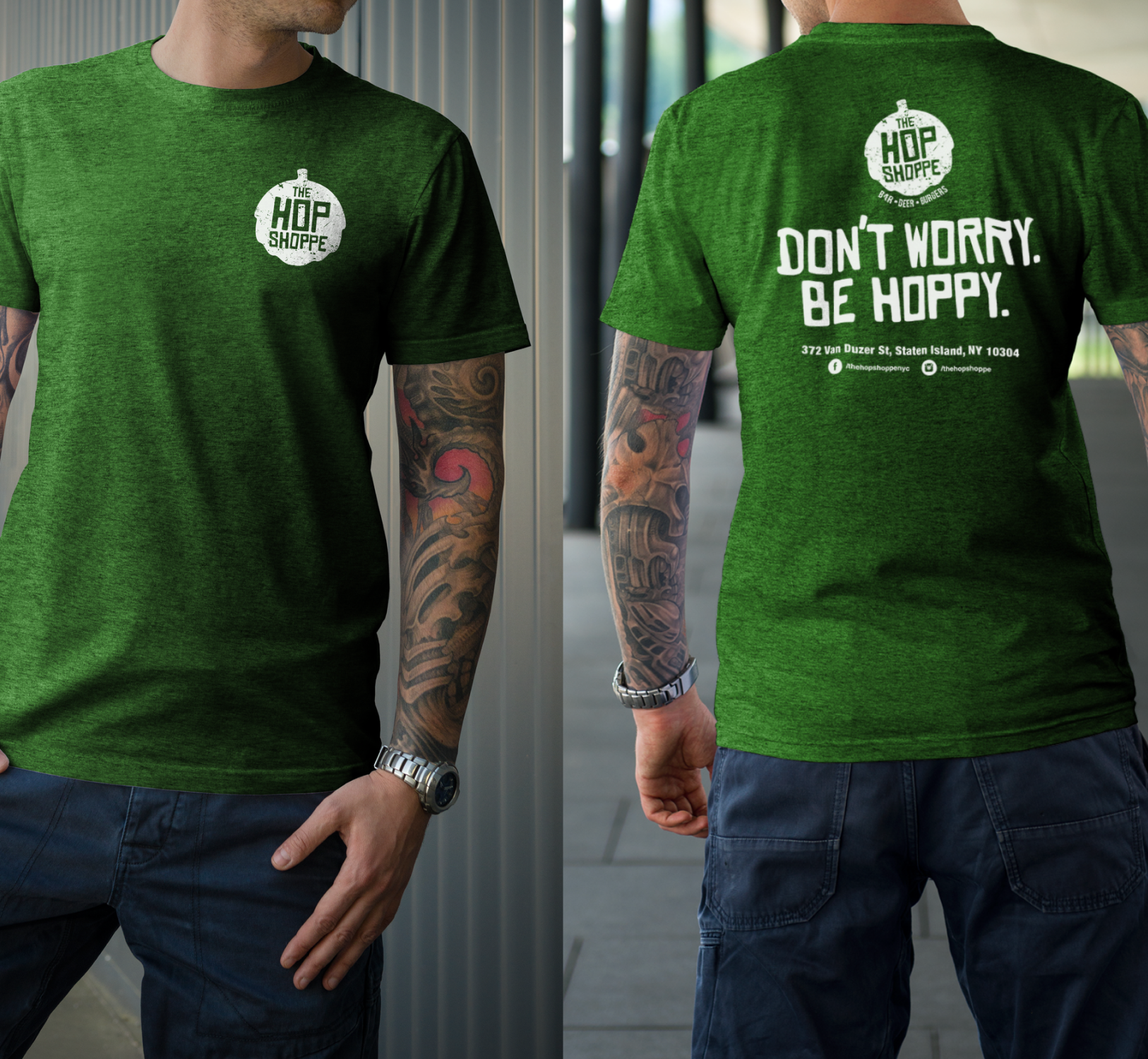
I designed the full brand identity, logo, and supporting materials, creating a fun, fresh take on the classic hop symbol with a custom typeface that reflected the pub’s bold personality. Building on this foundation, I designed and developed a custom WordPress website that visually aligned with the brand while offering a seamless, user-friendly experience.
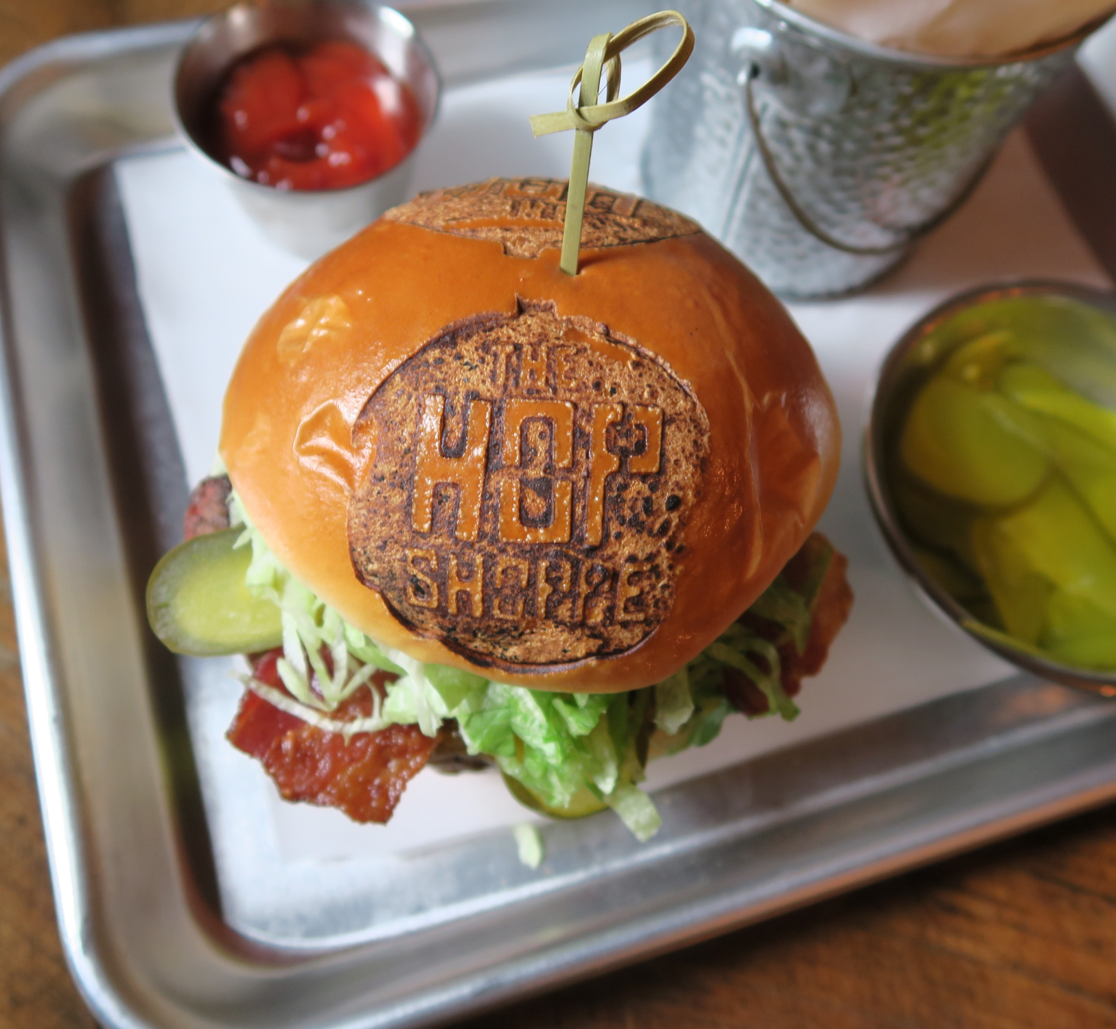
The site highlights featured menu items, promotes upcoming events, and connects directly to the pub’s active social channels to encourage engagement. Every element — from the color palette to layout hierarchy — was carefully crafted to convey energy and approachability. By unifying the visual identity across logo, web, and print materials, I delivered a cohesive, memorable brand presence that helped position the pub as a lively neighborhood destination.
TASKS
Logo Design
Visual Design
Branding
Graphic Design
Typography
Visual Identity
Website Design
Website Development
Print Design
TECHNICAL